Who’s Skaer-ed of Lucy? A Show Dedicated to History and Language
- Christian Hain
- Oct 20, 2017
- 4 min read
Updated: Mar 23, 2020

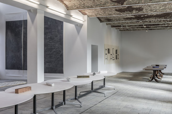


(Berlin.) KW Institute starts into the winter season with a solo of Scottish artist Lucy Skaer. In the beginning, there’s a table, or many, antique and linked to form a wooden centipede with lapis lazuli borders. Whoever sits down here, will be served geometric objects that abstractify the whole installation. Chairs there are a few, albeit rather impractical: On a large print on the wall, drawn from different angles. Contemplating these, you instinctively mutter: “Kosuth Reloaded”. That print was part of Skaer’s 2009 Turner Prize installation Thames&Hudson, before her gallerist added it to his private collection.
This is not a river. And no publishing house, either. But in 1949, Austrian émigré Walter Neurath named his art book company for the waters of London and New York - then chose saltwater dolphins for its logo.
Not by chance the chairs seem reminiscent of pictograms, or hieroglyphs; Lucy Skaer is fascinated by typography. Continuing through the show, there’s more language, but you won’t necessarily notice, even if the overall title is Available Fonts. In Skaer's world, everything may function as a font, might stand for something else, everything can be a signifier, all is written. A grey canvas breathes solemnity, looking from up close, there’s aboriginal(?) patterns - tiny little spirals, scribbled all over it. More forms appear once you take a step back again, or they should at least, but you won’t see them if you never saw anything in those “Magic Eye” books either (not published by T&H). There’s supposed to be a head, and another chair, apparently.
Thus, we get confronted with two of Lucy Skaer’s favourite hobby horses: Language systems, forms abstract and concrete. Time’s a third; the passage of time, and history, of art and all, omnipresent in the show. It’s true not only from a formal point of view, with an overview of Skaer’s career so far on the first floor, and a brand new series further upstairs. Neither for how these works blend into an exhibition space brimming with scars and traces from its industrial past, almost like an in situ installation, alone. Ditches and ceilings are an art by themselves, in a building the opposite of energy efficient white cubes - KW never looked so good as at this stage of renovation, with accidental forms and lines, unplastered walls, all around!
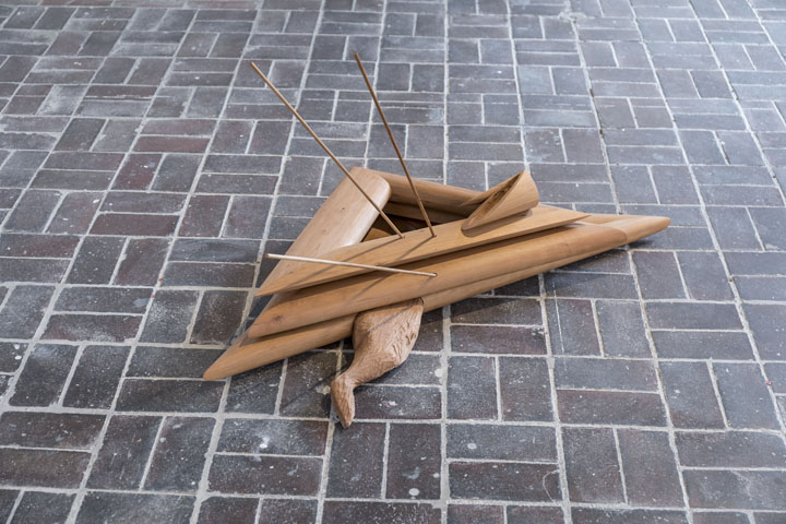
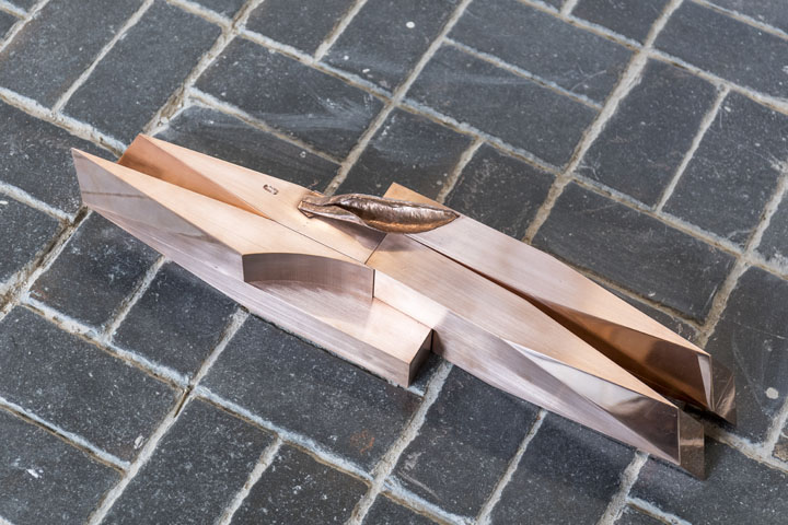
Upstairs, mud toned objects, clay or wood, litter the floor. Carved rabbit legs and ears add to unidentifiable forms. I admittedly first took it for an homage to a recently deceased publisher personality (->bunny ears), but soon remembered, this is the 21st Century, and art. The artist explains, an ear, an eye - you would not recognize the latter if you didn’t know - adds emotion to abstraction, and turns it into something else, something unique. Where not crushed by triangles (->art history/religion; or for the millenials: that band "∆" ), the poor critters appear pierced by arrows that point to hunting traditions, to life and death, creation and destruction – and art documenting them. Art, and arrows are apt to evoke a multitude of connotations and memories. Depending on your background, feel free to summon paintings from St Sebastian to Hastings and Kussnacht. Rabbit, run. But that’s no longer hermeneutics, merely reading something into a text, a font, that might be there, or in yourself alone.
The forms get more and more abstract, the hares disappear, that’s not a camel, nor an elephant, and no deer either (nor a toy AT-AT), then it’s only red dots, blood as the essence of hunting, living, death, and everything that flows? They interact with markings on the floor, the black and beige bars of art with a green cross some workers left, next to more red. The windows are plastered with tree sap to imprison snippets of film rolls, like amber trapped travellers from a prehistoric past.
Lucy Skaer cites a 14th Century Livre de chasse for her inspiration, the (new) artwork intended as a “three dimensional tableau”. Hunting scenes were also most common in medieval tapestry, another medium, she is fond of using from time to time. From above, peeking over the balcony into the atrium, the carpet in front of that grey print appears formed like a tongue, and there’s patterns, or: writing/fonts, on it.
Just how recent some works are, you realize when “reading” two small pieces on the wall. The artist used a (left-wing populist) newspaper’s printing plates to depict the great London Fire not of 1666, but 2017. The artist denouncing “austerity’s” responsibility for the disaster, there might be the idea behind, nothing’s really changed.
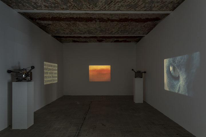
In her obsession with history, Lucy Skaer could be called the non-video version of Stan Douglas. That said, there is actually a “three channel video projection” with 1970s style projectors, downstairs. One film shows details of a cat, the second pages of an old book – a historic Gutenberg Bible we learn, and the third a red door. Sooner or later, you realize, the “door” is a Rothko painting, and there are more, succeeding one another on screen(/wall), all sourced from the same German museum collection. White forms appear, and you turn around to see whose fingers before the projector summon the silhouettes, but these triangles and different geometries are part of the artwork. The camera zooms in, the white flickers, the red stands alone, then out again. The overlaying forms took their shape from public transport tickets, stamped out by random conductors, but this you only learn if you take the time to read all meta-information to the show.
A font is just another mode of expression, a technique, a style, it needs be chosen and used, a means of language; maybe Lucy Skaer could have talked of available materials, too. The artist “writes” her work with what is given. Everything, not only art can be treated as language, conveying encoded messages. Now go, and make sense.
Lucy Skaer, Available Fonts, 13 October 2017-07 January 2018, KW Institute
World of Arts Magazine - Contemporary Art Criticism
Comments