A Jack of all Trades – Jack’s Jacks by Jack Whitten at Hamburger Bahnhof Museum
- Christian Hain
- Apr 10, 2019
- 5 min read
Updated: Mar 23, 2020
(Berlin.) Hamburger Bahnhof Museum is a thoroughly modern art museum and as such, it follows the zeitgeist. A politically correct reassessment of the proper past and collection happened last year already, and the first artist to be honoured with a solo show in 2019 - well, that’s unfair. But it’s indeed hard to escape contemporary politics when talking about Jack’s Jacks at Bahnhof. Jack Whitten was an American abstract painter, of which there has never been a lack in the 20th Century. Some are justly forgotten, and others are not, but it certainly doesn’t seem amiss to assume, his rediscovery happens for a reason that lies outside of the art context. Best take a deep breath in the antechamber, close your eyes, and vow not to like the show on principle, merely because Whitten was a black/Afro-American/negro/coloured/call-it-whatever-you-like, the terms are all exchangeable, no, really: they are – what’s in a name? and dangerous is only ever the censorship and cleansing of language, artist, nor, on the contrary, to dislike it in stubborn protest against the drumming-in of an agenda that overshadows every discourse, and obscures every view, not only on art today. Having freed yourself as far possible from ideological prejudice, you can then try and focus on the things that really matter, Jack Whitten’s paintings being quite impressive for instance.
Jack’s Jacks is Whitten’s first ever museum show in Europe, and the artist, who passed away last year, has still been much involved in its preparation.
You should take the time to watch the introductory video, a filmic autobiography, in that antechamber. Perhaps the most surprising aspect of Jack Whitten’s paintings is their being nothing else indeed: What appears like mosaics, or collages with pieces of plastic and glass, are in every single case only layers of paint. Whitten would apply the acrylic pigments to an object - a common bottleneck or whatever else seemed appropriate -, then, soon as they had dried, remove and transfer them to the canvas, or, alternatively, use special (self-made) tools. The resulting aesthetics link to the far-removed past - “true”, antique, mosaics – and the future alike, in appearing very modern - perhaps even too much so, anachronistic, - by evoking pixelated computer graphics. Whitten expressed himself deeply interested in scientific theories and technological “advance” from home computers to quantum physics.
His almost “sculptural” paintings are abstracts with a twist in that they have a figurative, and literally decipherable, dimension given away in the titles. They are in fact portrays of personalities from different branches of life, science, arts, politics, “translated” into abstraction, part metaphor and part “psychological synaesthesia”, with a tiny touch of Kandinsky-like spiritualism (only in linking colours to moods/personality/soul). Whitten’s concept proves the most successful in the case of fellow artists, and there have been many among his (virtual) sitters, from Delacroix (via the soft colours he mostly used: Delacroix’ Palette) to Ellsworth Kelly, Robert Rauschenberg, Andy Warhol, Louise Bourgeois, Cy Twombly, and Whitten’s teacher Willem de Kooning (Bill’s Way for Bill de Kooning: a sliding puzzle like pattern of coloured blocks). They all follow the same basic idea, quoting typical traits and colours. Portraits of - Jazz and other - musicians don’t seem implausible either; in the case of Prince it might be even too obvious: seems like Whitten just left the canvas (three of them, a triptych) outside in the rain overnight, a purple rain... (but no trace of medication in the picture.)
Other identifications appear more dubious, which of course doesn’t diminish their artistic interest. Much as I tried, I couldn’t see the link between a poisonous neon green “melon” and Stanley Kubrick – would not some orange, or a shining blood-red, have been the better fit (no black monolith around, either)? As it is, the work reminds more of 1980’s video games, Frogger, Space Invaders, and besides, that screaming neon is just “too beaucoup, too beaucoup” (sorry, very inappropriate quote) for the eye. - Yet, some other visitor claimed to see the connection perfectly.
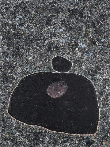
Maybe Whitten had a dream of a film project bringing together Kubrick and a certain boxer: The Black Monolith (Birth of Muhammad Ali). Again, details invite to debate: The chaotic background, white (sic!) noise, assaulting a central black form might well stand for that war, for hostile politics, and crowds gathered around a boxing ring, but that central form... almost reminiscent of a Mandelbrot set, it resembles more George Foreman than the agile butterfly-bee. Too heavy-weight for Ali, or plainly spoken: too fat. The red form at its heart should be exactly that, the inner force Cassius Clay had to muster for his rebirth.
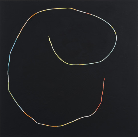
Theta Group does not refer to some obscure band, and indeed no person at all, but – thanks, Wikipedia – is about quantum mathematical... somethings. Elements of it bear a remote resemblance to the circles and lines surrounding da Vinci’s Vitruvian Man, but this might just be by pure chance.
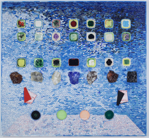
Whitten’s bow to Barack Obama, who honoured him with a medal, leaves us somewhat confused. Apps for Obama shows the home screen of an iPhone, or –Pad, with many different coloured icons. The current US president has come under fire for using an iPhone (not because Silicon Valley and the NSA are listening, but Russians and Chinese supposedly do the same) and even if his predecessor famously once tweeted from a – borrowed - iPhone, which was a great publicity stunt for Apple Inc., he did rather not use unsecure technology in office. That’s not what this artwork is about, but... yes: what is it about? Coloured apps to use and play with? “To play the colour/race card” is not a nice thing to say, and Obama seldom did it consciously (contrary to those imbeciles awarding him with a Nobel Prize for the sole merit of having been born slightly more tanned than others, but he did not appreciate that nonsense himself). Best don’t dig too deep, and just accept the homage.
Now, finally, having treated the art, we should briefly care about the political dimension (that, as a general rule, should always come last, and never be more than a side note, not the main interest). Jack Whitten was a modern man, even before the time. You find him quoted with the words “I sincerely believe that in the black community of artists, especially those of us dealing with abstraction, art has to go beyond the general notions of race, gender, nationalism. Things have evolved to the degree where there is a possibility of a new sensibility out there. We’re into a global aesthetic here, and anyone that doesn’t see that has a real old-fashioned way of thinking.” (interview with Art in America, 2013, as quoted in the NY Times orbituary from 23 January 2018.)
He obviously was one of those who want equality, not diversity - these are indeed antonyms. Growing up in Alabama, witnessing Martin Luther King speak in Montgomery, organizing protests while studying in Louisiana, Jack Whitten was a political man. He also seems to have taken the struggle for unification serious - maybe Whitten even wanted to “whiten” himself (before you should ask: no, there’s no portrait of Michael Jackson in the show), i.e. to become “white” in one way or another. These most modern ideas are reflected in the MLK-dedicated King’s Wish (Dream) - an explosion of colours floating together (you’re still free to argue, this superficial, outer, form of diversity as driven by an ever growing earth population, by infrastructure and capitalism, annihilates true diversity, and creates the most boring, and most American, homogeneity of manners, culture, and thought). In this context, it is not irrelevant to mention that Whitten married a white woman, and their children - who were attending the Berlin opening -, appear already (visually) eloigned from his identity - and that multicoloured dream.
Jack Whitten, Jack’s Jacks, 29 March-01 September 2019, Hamburger Bahnhof Museum
World of Arts Magazine – Contemporary Art Criticism


Comments